Room to grow
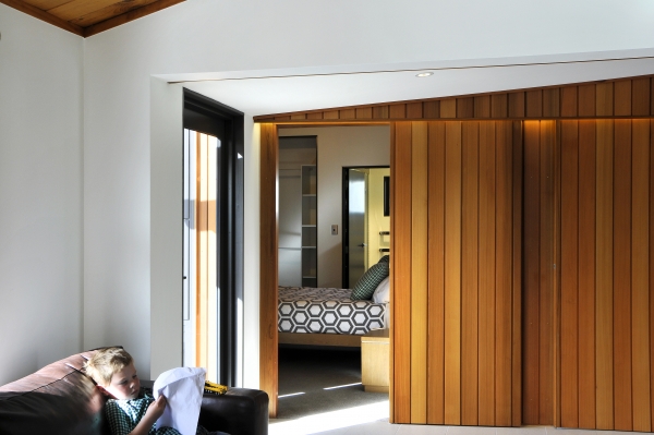
Have I said how much I love working with families and giving them room to grow? Well this project has certainly been no exception. Originally a family of three, over the time we were working with them they increased to four. When I visited them last week it was wonderful to see the kids racing around and making the most of their extended living spaces.
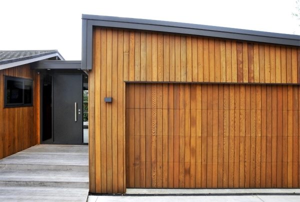
There was an old house on the site that really needed renovation, an additional bedroom and a garage. They wanted a new extension that that contrasted yet complimented its simple lines and timber aesthetic. Having seen a property we designed nearby, they knew that a similar design language would be applicable to theirs.
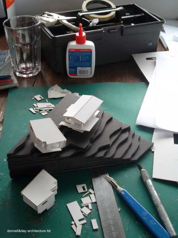
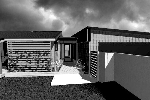
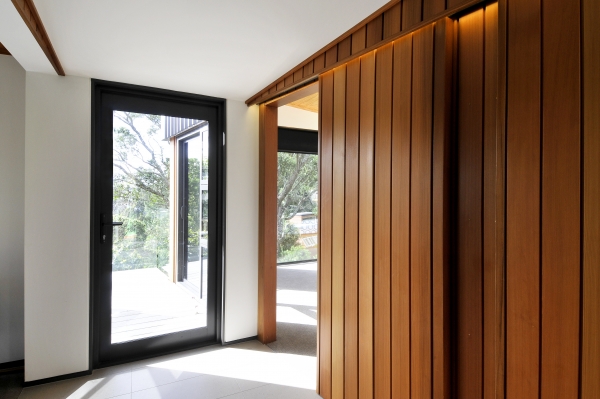
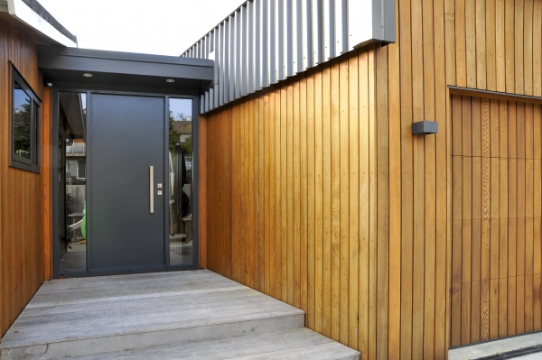
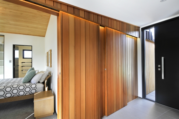
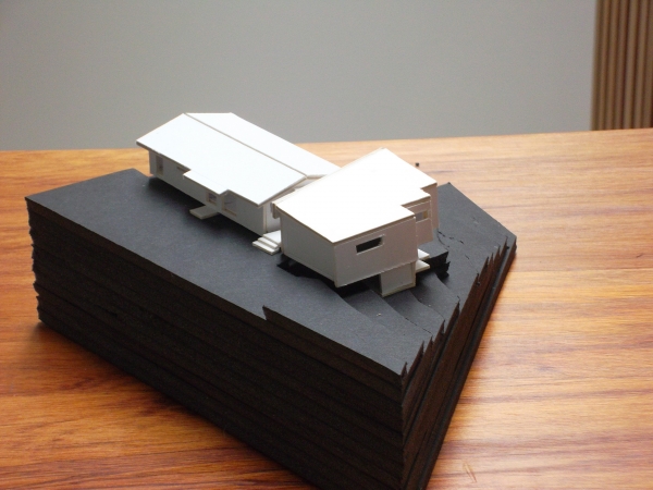
Design began with models and sketches, working how best to fit with the dramatically sloping tree filled site and angled boundary, while avoiding a huge building volume on the road. We explored various options with them before settling on a stepped form that minimised the depth of the extension and provided a glazed transition break between the new and the old. This was designed to become a new entrance way (gifting its old space to the living room). The cedar cladding was designed to flow through the transition zone and new double glazed joinery throughout the extension and the existing rooms provided consistency of detailing.
After refining the design and then preparation of the Building Consent drawings, construction was managed by the clients and their selected builder. We helped if they needed any advice on tricky areas, but they both did a wonderful job of bringing the drawings to life.
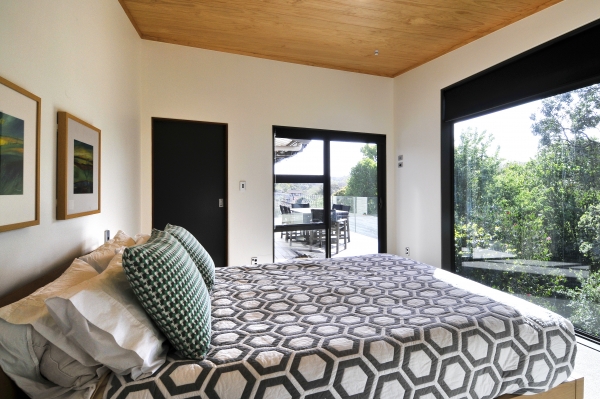
The final result captures the beautiful views of the site and inside the spaces are warm, light and tactile. It was sweet to hear one little voice say proudly to me - 'This is my HOME!!!!' ... that was lovely as gets to the very heart of what motivates us to do what we do.
Many thanks to Kim Neville for her wonderful photographs!
