Sketch
In the early concept stages of a design, I find myself going through many sheets of butter paper or notebook pages as I sketch out ideas. These drawings are NEVER tidy, refined or presentable, but are ways of bringing an idea to the surface and are part of the design process. It's actually not a stage the client gets to see, as typically I have tidied up the sketches so they make a lot more sense by the time they see them!
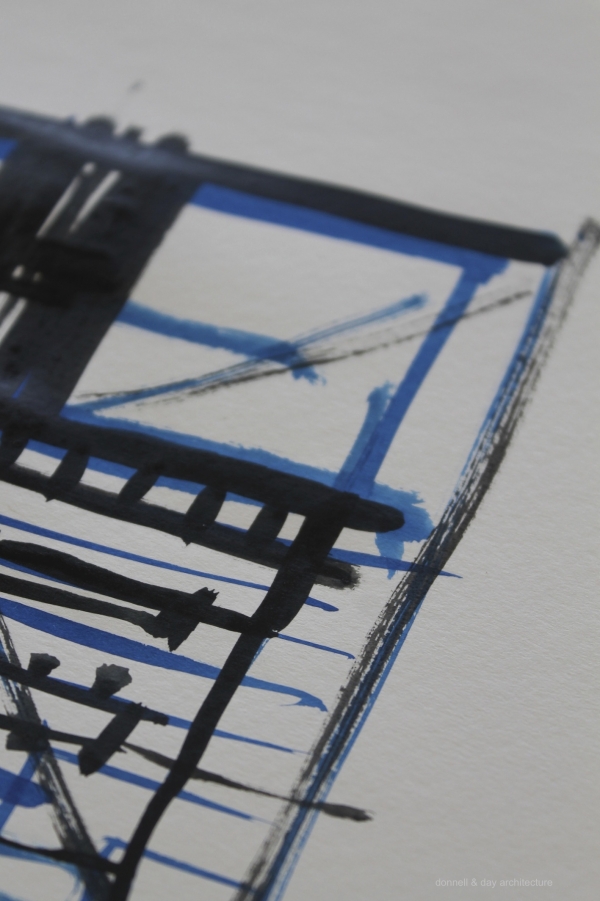
When an idea strikes it's important to capture it - these very early drawings are a means to explore form, space, openness and enclosure, light and the 'big idea'. As the idea solidifies I find my drawings get more detailed and refined, but my initial sketches are always full of multiple lines, overlapping forms reinforcing the thoughts and ... well ... are generally pretty messy for anyone else to interpret!
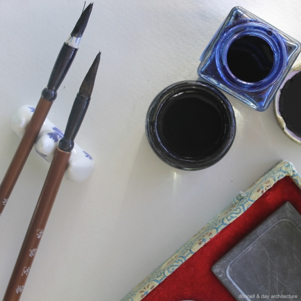
The weightier media (eg. ink, charchoal) are sometimes used at these stages to help thoughts flow and to loosen up ideas. This design process is different for many people in the creative industries - but I find it is crucial in designing a concept for architecture that intuitively responds to the site and that has a solid concept at its core.
When I am out and about a pen and a notebook or tablet + pen usually serve as a good way to quickly grab an idea. They are not intended as brilliant works of art, so I feel somewhat apologetic in releasing these fledgling thoughts to the world before they are able to fly, but hopefully they serve to illustrate part of the journey to get to that 'eureka' moment!

